 When I saw this flag (or one very much like it) hanging from a porch in my neighborhood, I stifled a scream, and decided that I had to do a flag for Earth.
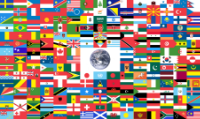
There are several unofficial flags for Earth out there. This one is arguably the worst. It’s a nice idea, I suppose: representing the diversity of the peoples of Earth, but the execution of it shows that the idea can’t work. It’s just a mess: a bunch of unreadable noise.
 One legit flag that could represent Earth is the United Nations flag. It’s not a horrible flag, and the blandness serves the UN’s purposes well. You can paint a military helmet this shade of blue and people will immediately recognize that they represent UN peacekeepers. But the emblem of continents is too detailed and fussy to draw.
 In 1969, peace activist John McConnell offered this design to the UN, obviously inspired by the photos of Earth taken by Apollo astronauts. There are also versions of this that substitute the famous “big blue marble” photo of Earth taken in 1972 or some other photo. All of them suffer from the same lack of simplicity.
 The following year, farmer James Cadle proposed a much simpler flag, with circles representing the Sun, Earth, and Moon. I kinda like it, particularly the idea of including the satellite that’s such a critical part of the Earth-Moon system.
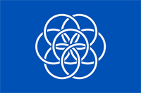 Recently, Oskar Pernefeldt proposed a flag for Earth. His interlocking circles symbolize the seven continents, interlinking into a flower. It’s a nice concept, but again flunks the “Can you draw it from memory?” test.
One thing that all of these designs take as a starting point (even the trainwreck at the top) is that there needs to be a circle in the center. I decided to reject that principle. After all, Earth is not the center of the universe.

As much as I complain about putting illustrations on a flag, I chose to go with an abstracted one. One of the things I find most striking about images of Earth (which gets lost in those long-distance shots) is that thin layer of atmosphere around it. This is a medium-distance abstraction of Earth, reflecting how it looks when you get close to it. It’s green-encrusted ground, blue-reflective oceans, and that blue-refracting border of air. It intentionally doesn’t depict any place in particular on Earth, just the combo of features that makes Earth was it is. And taking a cue from Farmer James, I used the Moon off to the side, for visual balance.
 The official logo of the Republican Party is a stylized elephant, a symbol originally derived from a Thomas Nast cartoon from 1874. The modern Republican Party bears no resemblance to that party, so it’s time for a brand makeover.
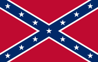 Once the enemy of the Confederacy, the Republican Party has long since put that behind them and embraced it. Racism, contempt for the federal government, and racism were hallmarks of the Confederacy, which are now pillars of the Republican Party.

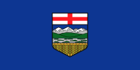 Alberta’s flag is Yet Another Shield on a Blue Field. The shield has some redeeming characteristics, I’ll admit, mainly the fact that it’s somewhat simplified art, and not Yet Another Pair of Figures Standing Next to a Coat of Arms. Because the figures are missing.
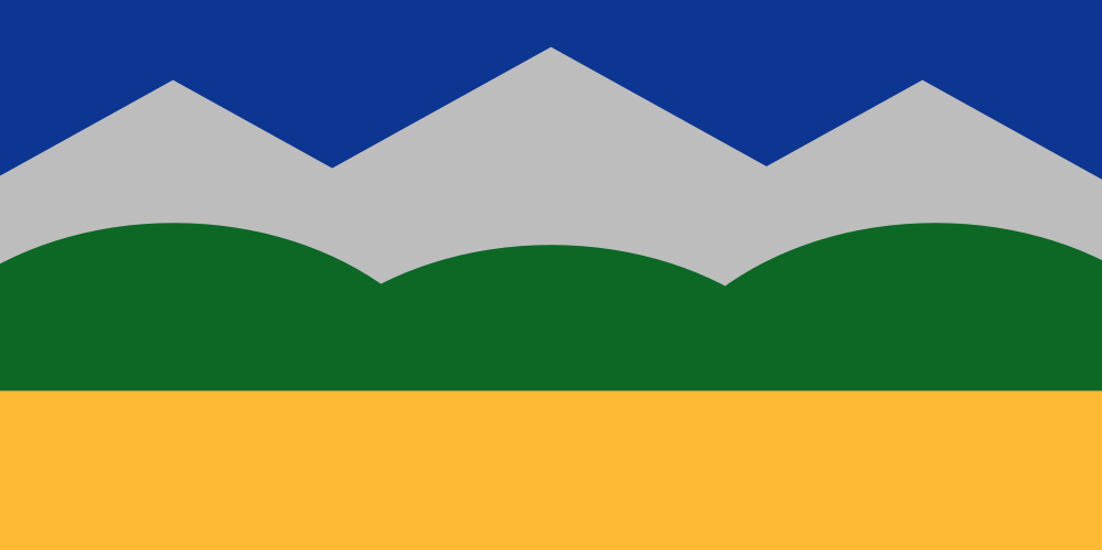
 If you can’t tell the difference between the current Alaska flag and my version, that’s because there isn’t much.
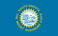 South Dakota’s flag has a sad, sad history to it. Sad because it documents the slow degeneration of a cromulent state flag into another vexillological abomination: a seal on sheet, with the name and a tourism slogan. (The fact that the tourism slogan promotes an attraction that wrecked a site sacred to Native Americans, is just shit icing on the shit cake.)
 I’m not gonna tell you that the original flag was a really good one, because it wasn’t. It had the name and the state’s nickname on it, which is kinda bad. Then the idiots in the South Dakota legislature added the state seal. And in 1992 they updated the nickname to push their one big tourist attraction. The result is up there at the top. Feh.