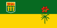
 Canada’s provincial flags include some real trainwrecks, but Saskatchewan’s isn’t one of them.
Saskatchewan’s flag does, however, commit the sin of shoving a coat of arms into the corner, which becomes too small to read as soon as you get any distance from it, and just makes the flag look bad. The arms also includes an English lion, which is leftover imperialism, and Canada really needs to get over that.
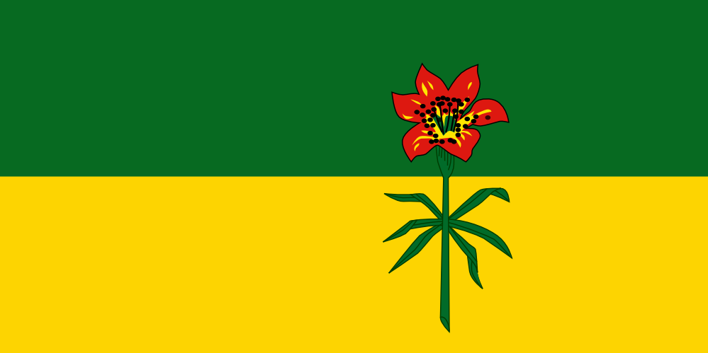
But this was easy peasy to fix: take out the crest. To fix the visual balance, I adjusted the size and position of the flower, which is a prairie lily, native to the region. The design of the flower is a little overly detailed for a flag, but it’s stylized fairly well, so I left it for the sake of tradition. The green and yellow background represents the province’s forests and its wheat fields (which is why we don’t need the bales of wheat in the coat of arms).