The history of the flags of Georgia is a long history of horrible, racist, and sometimes horrible and racist flags. Instead of just showing you the latest flag and my replacement, I think it’s instructive to look back at the whole history of Georgia’s flags. If nothing else, it’ll show you how little I had to work with that could be salvaged.
 The state’s original flag was your standard American abomination: the state seal on a field of blue. Even in its fairly simple form, it’s an illustration of a person and several words, in a fussy mess that looks like every other crappy state flag. The fact that it was hastily created to fill the need for a state flag in the South’s war of treason against the United States just makes it worse.
 Fifteen years after losing that war, the state adopted a proper flag. It’s not technically a bad design… purely as flag designs go. But it’s a little derivative, and it was adopted as a very deliberate homage to the flag of a certain federation of which Georgia was a founding member.
 No, not the United States. The Confederate States. For comparison, here is the official flag of the CSA, which was nicknamed “The Stars and Bars”. You’d probably guess by now that I don’t care for the circle of stars, which is too cluttered, but otherwise it isn’t a horrible design… except that it fails the most fundamental purpose of a flag, which was to be easily recognized on the battlefield. This dumb-as-fuck design looked too much like the flag of the country they were in treason against especially in battle, which literally confused people who were trying to kill each other, and that’s why this flag never became popular, even among racists. Instead, racists fondly remember the battle flag. You know that one.
In 1902, Georgia combined their Confederacy-wannabe flag with their regiment-of-the-Confederate-army flag, by stuffing their state seal into the smaller field of blue. I’m not gonna show that one, because you can figure it out in your head. A few years later, they added the word “GEORGIA” and replaced the seal with… a worse version of the seal. I’m not gonna show that one, because I am not a cruel person. In 1920 they redrew the seal as a white circle with blue lines, and the date 1776 to pretend that they’d forgotten about 1861 and now considered themselves part of the United States.
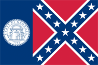 In the 1956, the legislature of Georgia realized that they were entering modern times, so they adopted a new flag without all that baggage of the past, one that represented the future…. oh, who am I kidding? They pulled down their pants and squeezed out a turd to show their contempt for the present and the future, inserted their heads into the vacancy, and replaced the bars that were too much like the stripes of the United States flag, with the fucking Battle Flag of the Confederacy, to show just how racist the white people of Georgia still were. P.S. it’s also an ugly design, shoving two incompatible flags together.
This lasted until 2001. Incredible.
With the 21st century underway, there was considerable pressure for Georgia to give up on the fucking Confederacy and join the 20th century. The governor, bless his heart, proposed and rammed thru a replacement. Which was god-awful in oh so many ways.
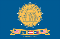 The state seal was the focus again. But with the 13 stars representing the
 original colonies Confederate states around it. And a dumb-as-fuck, ugly-as-shit banner showing previous flags flown over Georgia. The original Betsy Ross flag. The Confederate regimental flag. The neo-Confederate seal flag. The neo-Confederate battle flag. And the U.S. flag. And “IN GOD WE TRUST” at the bottom, just to make sure that people also understood that freedom of religion is a lie. This is the flag that earned Georgia the position of 72nd out of 72 in the North American Vexillological Assocation’s survey of U.S./Canadian flags. It’s that fucking bad.
Hint: you can’t fix the problem of having Confederate symbols on the flag by making them smaller, in a design that looks absofuckinglutely horrible.
 The “good” news is that this flag was so bad that the state legislature was prompted to replace it. Which could have been a happy ending. But they replaced it with this. That’s right: the actually went back to the Confederate States of America flag design, this time with the state seal and the stars honoring the 13 Confederate states.
Fuck that shit. Fuck all of that shit. I can’t even.
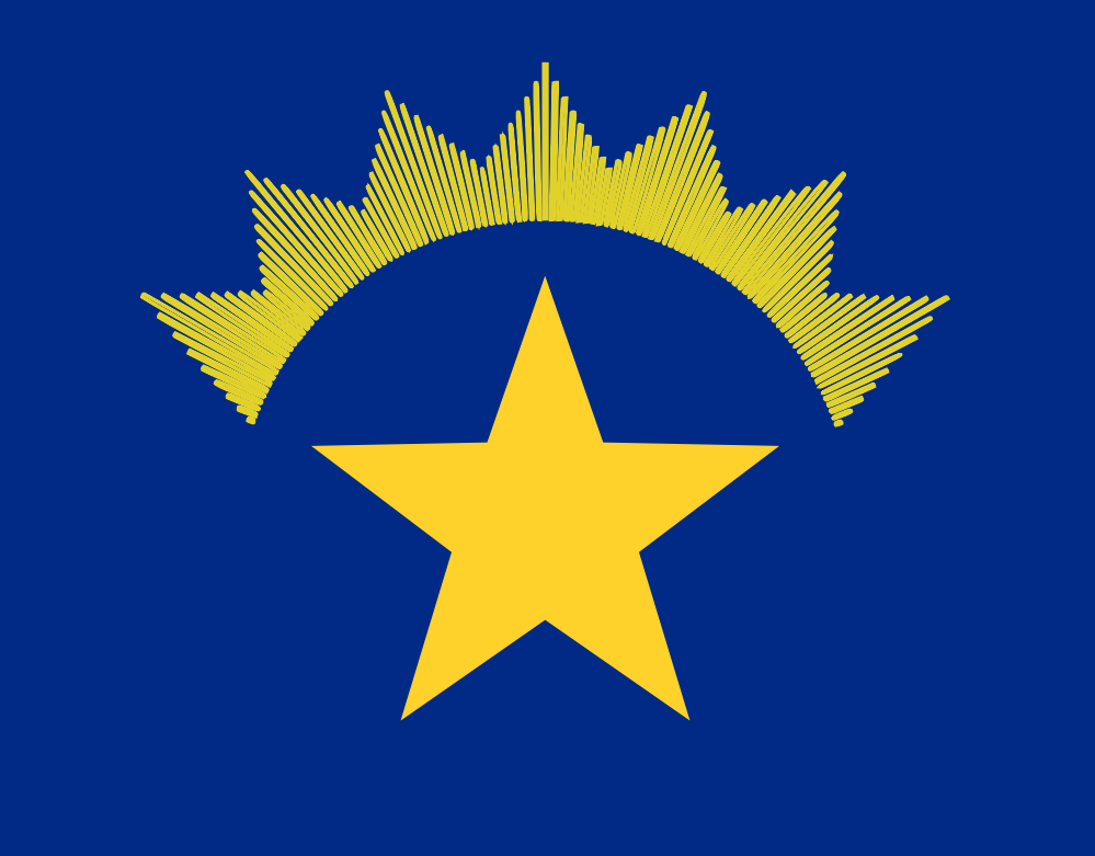
 Georgia’s new flag doesn’t get to use the colors of the Confederate flags. Too many feeble attempts to pass them off as U.S. colors. Instead it gets the 1879 flag redone in the colors of Georgia’s most famous crop: peaches. Still leaves a sour taste in my mouth, but it’s at least a cromulent flag.

 If you can’t tell the difference between the current Alaska flag and my version, that’s because there isn’t much.
 I’m gonna catch holy hell for doing this one, so I might as well get it over with.
 Betsy Ross was pushing it by including a stripe for each and every one of the 13 colonies that were joining to form the union. Also including 13 stars was redundantly gilding the lily, though at least she found a nice pattern for them, so it’s identifiable as a thing in itself – a circle – not just a bunch of stars.
 The flag of Texas takes the U.S. flag and minimalizes the hell out of it: one star, one red stripe, one white stripe. I like that, but it goes farther than necessary. A “United States” flag needs to have stripes: plural. It just doesn’t need thirt-fucking-teen of them.
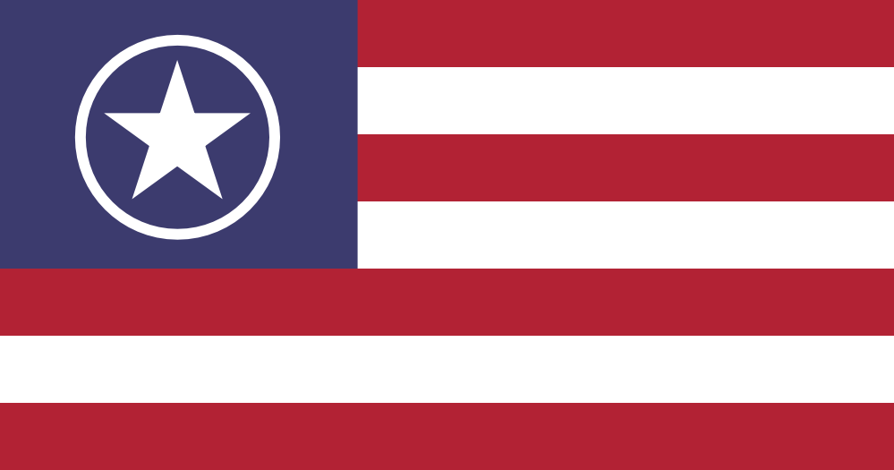
 Sometimes there’s a good design hidden in a bad one.
 Simplify.