
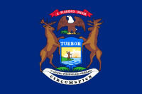
 Michigan’s is the state flag that inspired this whole project, and it’s a textbook example of how to design a flag badly.
It’s a shield-on-a-field, which is three strikes against it right there. In addition, it contains not one, not two, but three mottos in Latin: E Pluribus Unum (“from many, one” – copied from the United States), Tuebor (“I will defend”), and Si Quaeris Peninsulam Amoenam Circumspice (“If you seek a pleasant peninsula, look around you”). It also borrows the eagle from the United States, to go with its native elk and moose, and that’s not even getting to the crest with an explorer by one of the lakes, blah blah, blah. U-G-L-Y. All it’s missing to make me hate it more is the name of the state spelled out, and a smear of 26 stars somewhere.
I considered doing something with the elk and moose antlers, because both are authentically Michigany things that I like about the state. But this one’s a tear-down, for me to rebuild from the ground up.
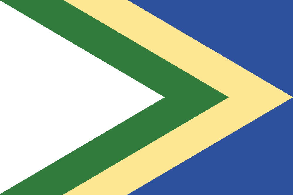
What defines Michigan? The Great Lakes are the most obvious thing. The beaches along its extensive shoreline are legendary. The northern Lower Peninsula and the Upper Peninsula are renowned for their woodlands. And in the winter we get snow that would impress even other northerners. Blue. Yellow. Green. White. In a stylized shape suggesting a peninsula.
And it just so happens that blue-and-yellow and green-and-white are the colors of our two biggest universities, which fight over being known as “the” University of Michigan State. I was careful to give each pair of colors the same amount of real estate, because the infantile rivalry of those people is insufferable.