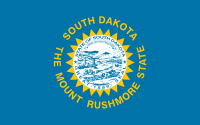
 South Dakota’s flag has a sad, sad history to it. Sad because it documents the slow degeneration of a cromulent state flag into another vexillological abomination: a seal on sheet, with the name and a tourism slogan. (The fact that the tourism slogan promotes an attraction that wrecked a site sacred to Native Americans, is just shit icing on the shit cake.)
You might not be able to read it at this size, but not only does it say “SOUTH DAKOTA” at the top of the flag, it also says “SOUTH DAKOTA” at the top of the seal. The seal also contains a theocratic motto (fuck that), the year the state was admitted to the Union (no one cares), and a messy, symbolism-littered illustration of life in South Dakota that you can’t even make out at full size.
 I’m not gonna tell you that the original flag was a really good one, because it wasn’t. It had the name and the state’s nickname on it, which is kinda bad. Then the idiots in the South Dakota legislature added the state seal. And in 1992 they updated the nickname to push their one big tourist attraction. The result is up there at the top. Feh.
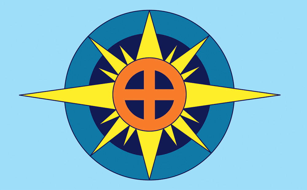
In my initial triage on the current flag, I ripped off the seal and deleted the words, and I was tempted to just go with the yellow sunburst on a blue field as a lucky discovery. But I felt it was missing something, something that said South Dakota (without literally saying “South Dakota”). So I looked to Native American symbology, and added a thunderbird design within the sunburst.
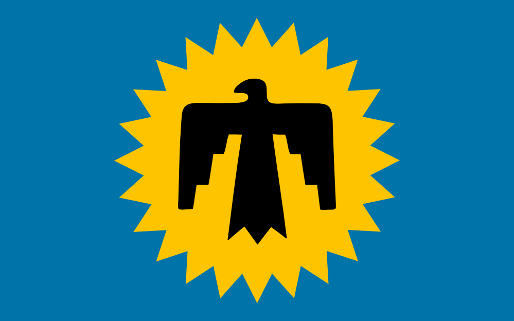
Several years ago, celebrated South Dakota artist Dick Termes undertook the same project and overhauled the flag. In 2012 he found a champion for it in legislator Bernie Hunhoff. But the idiots running the capital stonewalled it. Fuck them. It’s a good design, and I’m including it here as an alternate to mine. Termes had a similar idea, but instead of the thunderbird, he added a medicine wheel, another emblem native to the people of the region. He did more with the sunburst, extending the four-points symbology of the medicine wheel. I like it, and South Dakota should take a break from fucking with people’s lives with right-wing legislation, and and adopt it.
P.S. Termes’ gallery should be South Dakota’s biggest tourist attraction. I’ve never been there, but it looks awesome.

 Alberta’s flag is Yet Another Shield on a Blue Field. The shield has some redeeming characteristics, I’ll admit, mainly the fact that it’s somewhat simplified art, and not Yet Another Pair of Figures Standing Next to a Coat of Arms. Because the figures are missing.
 If you can’t tell the difference between the current Alaska flag and my version, that’s because there isn’t much.
 Michigan’s is the state flag that inspired this whole project, and it’s a textbook example of how to design a flag badly.
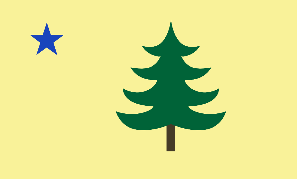
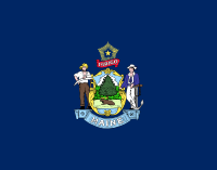 It was crappy state flags like this that inspired me to start this project. Like several other states, the legislature of Maine wasted valuable paper and a very little bit of their time, by writing a law that declared that their state flag would be their state seal on a field of dark blue.
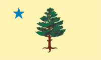 What makes their choice unforgivable is the fact that they were replacing something better, a flag that almost meets my standards. This was the Maine flag from 1901 to 1909. The blue star represents the North Star. Maine’s official knickname is “The Pine Tree State”, and pines were also used in a various other flags of the New England region. The only thing really wrong with this flag is the tree illustration, which is too fussy and detailed for a flag, and no two people are going to render it the same.