 If there’s any set of flags proportionally worse than American state flags, it’s Canadian provincial flags. I have family in Canada, so I feel I’m obligated to fix that problem too.
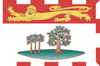
The flag of Prince Edward Island is a “what the fuck is going on here?” flag. Especially if you view it on a white background (which I’m doing as I type this… I gave this web site a gray background for this very reason), it doesn’t even make sense. That alternating red/white border on three sides with the red and white backgrounds is just… inscrutable. It doesn’t work, at all.
The interior is then simply a bunch of symbolic “huh?” At the top is an English royal lion (passant and or, on a gules field) a heraldry symbol of the Prince Edward the place is named for), and the main portion is a drawing of little island with three little oak trees (symbolizing the three geographic sections of Prince Edward Island) and a big strong oak tree (Great Britain) protecting them. Way to suck up to the royals, Edwardians.
I don’t know if anyone has mentioned this, but Canada is no longer ruled or protected or mentored in any way by Great Britain. They’ve kept the old queen on, calling her the Queen of Canada, but that’s not at all the same thing. It’s long past time for the Canadian provinces to drop the various emblems of the former British Empire… and also any sucking-up, while we’re at it.
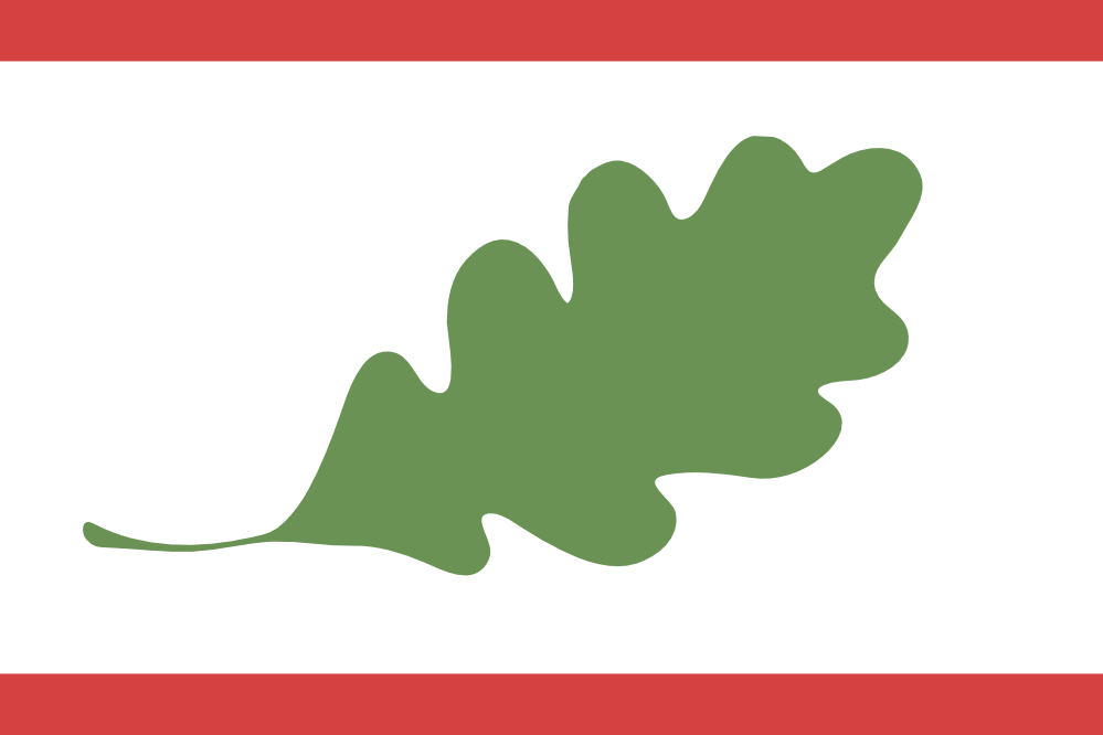
We start by eliminating the damn lion, of course. And since we’re dealing with a troublesome white field, we need to reinforce that red border a bit… top and bottom will do. That leaves us with the baby-oak-trees parable, which at this point is best chucked into the Atlantic. PEI (or at least Canada as a whole) can take care of itself now, so here it is represented by the silhouette of a singular oak leaf, on its own. Does this remind you of any other flags related to Canada in some way?
(Now, if you have really bad eyesight and squint, you might see the outline of Prince Edward Island in the oak leaf. On the other hand, if you have normal vision, you will see nothing of the sort: PEI looks nothing like this – and it looks even less like the island shown in the old flag. Which is good, because flags should not include maps. Yes, Cyprus: I’m looking at you.)

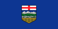 Alberta’s flag is Yet Another Shield on a Blue Field. The shield has some redeeming characteristics, I’ll admit, mainly the fact that it’s somewhat simplified art, and not Yet Another Pair of Figures Standing Next to a Coat of Arms. Because the figures are missing.
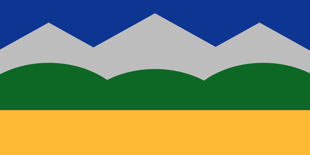
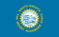 South Dakota’s flag has a sad, sad history to it. Sad because it documents the slow degeneration of a cromulent state flag into another vexillological abomination: a seal on sheet, with the name and a tourism slogan. (The fact that the tourism slogan promotes an attraction that wrecked a site sacred to Native Americans, is just shit icing on the shit cake.)
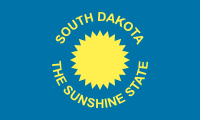 I’m not gonna tell you that the original flag was a really good one, because it wasn’t. It had the name and the state’s nickname on it, which is kinda bad. Then the idiots in the South Dakota legislature added the state seal. And in 1992 they updated the nickname to push their one big tourist attraction. The result is up there at the top. Feh.
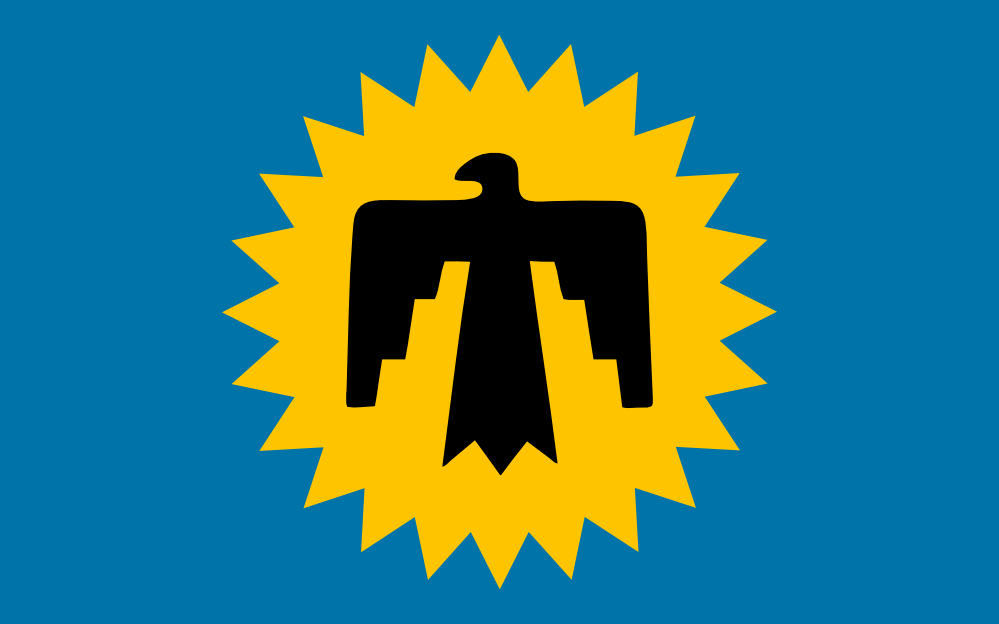
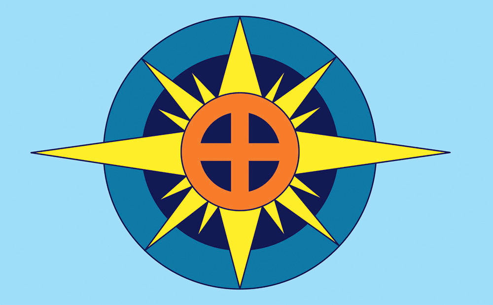
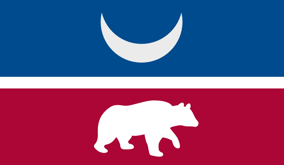
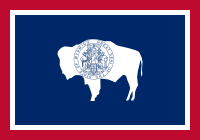 If you’ve been following this blog for a while, you can probably figure this one out for yourself. Wyoming has a fairly straightforward red, white, and blue graphic design with a simple white silhouette of a bison in the middle.
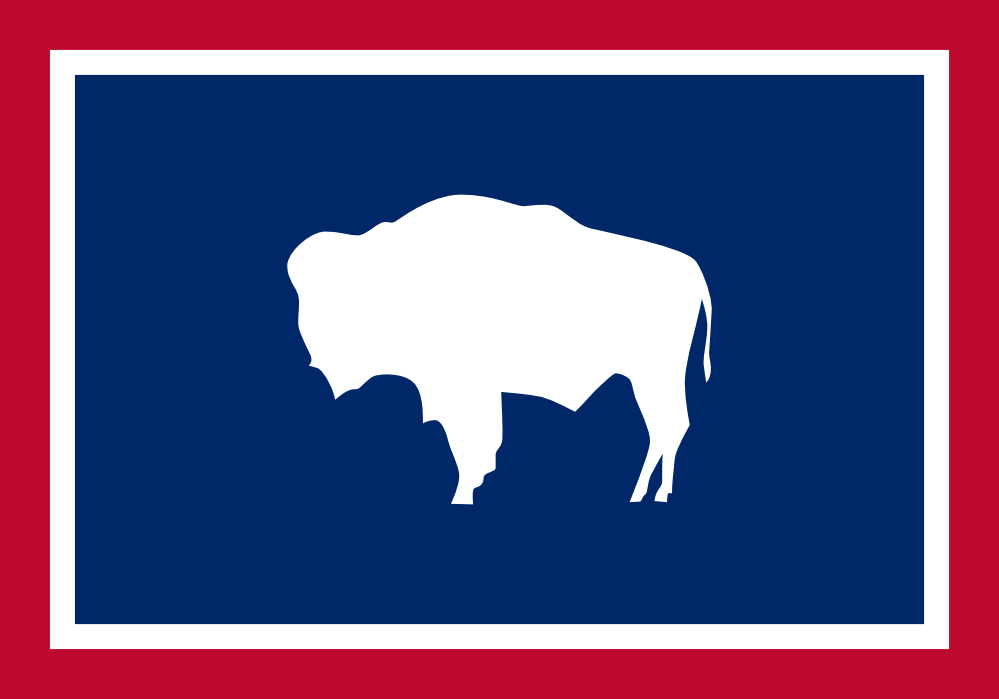
 Sometimes there’s a good design hidden in a bad one.