
 Sometimes there’s a good design hidden in a bad one.
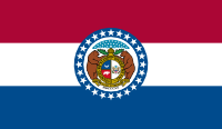
Missouri’s flag is one of the many with a state seal crapped in the middle of it. The seal has an array of 24 stars at the top, to indicate that Missouri was the 24th state. But they circled the seal with another 24 stars, to indicate that Missouri was the 24th state. At least it isn’t on a plain field of blue, like most of the seal-on-a-sheet state flags.
The seal includes the motto “united we stand, divided we fall” which is fucking ironic, because one of the design elements of the seal is a belt buckle, which symbolizes the state joining the Union… but still being able to unbuckle (i.e. secede and join a racist slave-holding confederacy… which to be fair, it did not… but they thought about it).
The seal also features two bears, which a least are native to part of the state. No, wait, there’s a third bear in silhouette inside the crest the bears are holding. Give me a fucking… wait a minute.
If you magnify that crest inside the seal, there are a couple neat design elements: a bear on a red background (it’s supposed to represent strength and bravery), and a crescent moon on a blue background (representing the newness and potential of the state, which is obsolete but a nice idea).
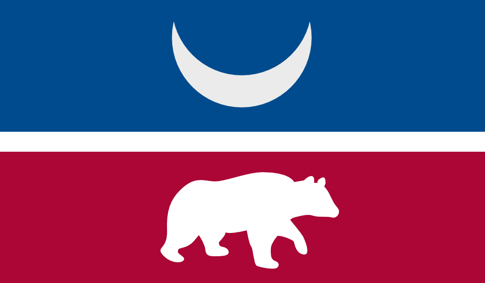
I’ve extracted the crescent and bear, and made them the focus of the design, incorporating them into the red/white/blue stripes of the existing Missouri flag. These stripes are flipped from the old flag, to match the combinations from the crest, which is important because it keeps the crescent against a blue sky.