
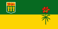
 Canada’s provincial flags include some real trainwrecks, but Saskatchewan’s isn’t one of them.
Saskatchewan’s flag does, however, commit the sin of shoving a coat of arms into the corner, which becomes too small to read as soon as you get any distance from it, and just makes the flag look bad. The arms also includes an English lion, which is leftover imperialism, and Canada really needs to get over that.
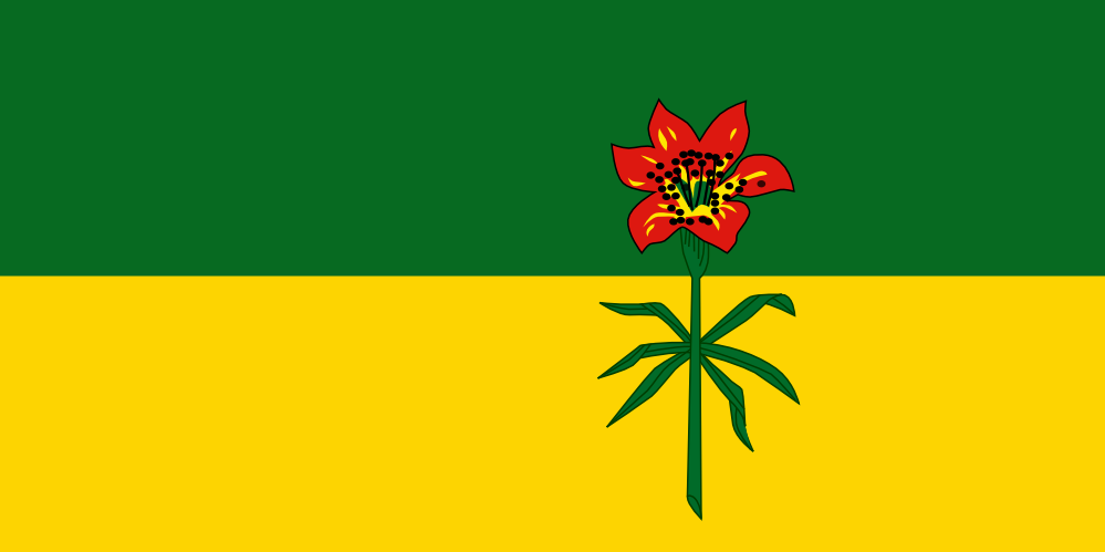
But this was easy peasy to fix: take out the crest. To fix the visual balance, I adjusted the size and position of the flower, which is a prairie lily, native to the region. The design of the flower is a little overly detailed for a flag, but it’s stylized fairly well, so I left it for the sake of tradition. The green and yellow background represents the province’s forests and its wheat fields (which is why we don’t need the bales of wheat in the coat of arms).
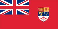 It replaces a god-awful 19th-century design that breaks the rules of good flag design into tiny pieces, by combining the tiny pieces of other flags. The “Canadian Red Ensign” committed the popular imperial sin of shoving the Union Jack – itself already a messy, compound flag – into the canton. It supplemented this fuck-up with a shield that combines symbols of… deep breath… England, Scotland, Ireland, France, and… a red three-maple-leaf thing that was used sometimes to identify Canada. Someone had the good sense to pick that out and focus on it it (a strategy I’ve taken with some of my flags here), and promote it into a national flag.
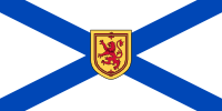 This post is at half-mast out of respect for those killed in the recent mass shooting in Nova Scotia. 🙁
 Second: the background is a reversal of the national flag of Scotland. Instead of a white saltire on a blue field, it’s a blue saltire on a white field. (It isn’t an exact copy: for some reason, Canadian flags are all wider than your typical flags.)