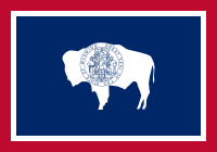
 If you’ve been following this blog for a while, you can probably figure this one out for yourself. Wyoming has a fairly straightforward red, white, and blue graphic design with a simple white silhouette of a bison in the middle.
But some idiot put the state seal in the middle of the bison. The seal of course has the name of the state, a motto, a year, and an illustration. Plus the idiot didn’t leave a margin around the seal, so it almost touches the edges of the bison. A sadly elementary graphic-design fuck up.
How do we fix this?
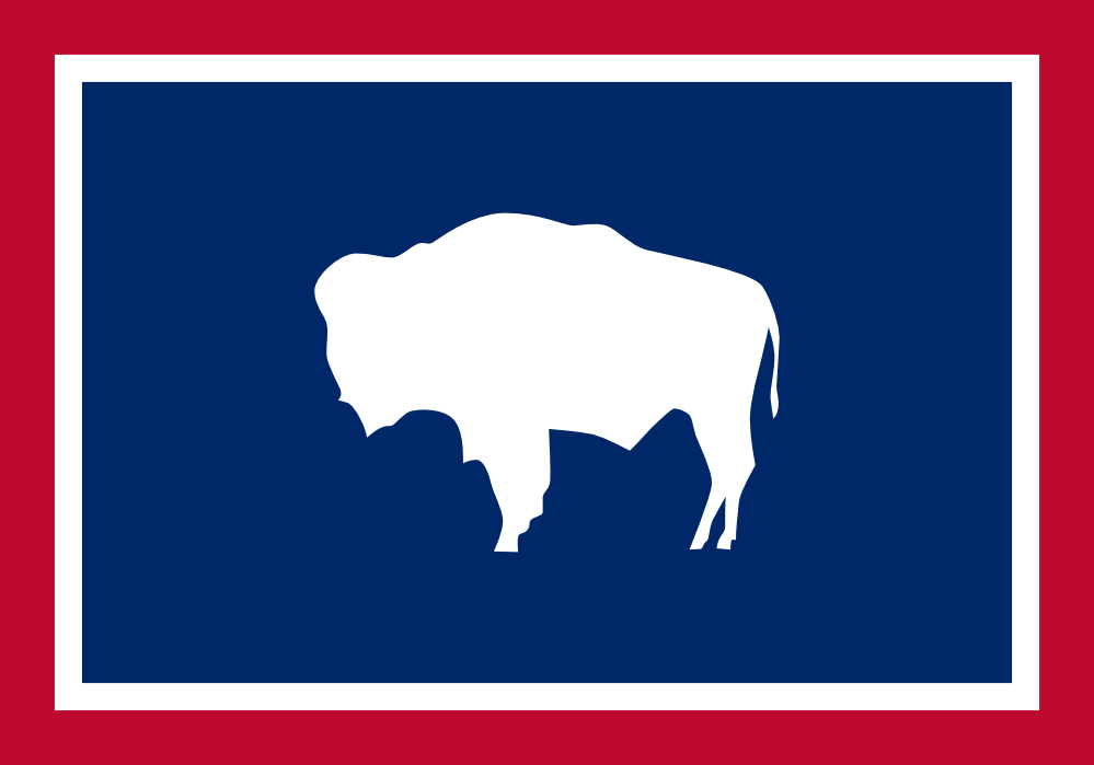
That’s right: remove the fucking state seal.