
 Maryland’s old flag is painful to look at. Somehow, it ranked fourth (meaning “good”) in the North American Vexillological Association’s survey of state flags! Those people have got to be out of their minds. I assume they gave it credit for daring to be ugly, or for engaging in some kind of perverse vexillo-illogical juxtaposition.
One of my pet peeves is when someone takes a state seal or crest and slaps it in the middle of a piece of cloth, and calls it a flag. This is essentially the same thing… they’re just filling the whole flag with the kind of design you’d get in some nobleperson’s coat of arms. Note: coats of arms are some of the most horrible graphic designs ever, other than 1960s concert posters.
The Maryland flag is two fundamentally incompatible designs put together, and their incongruity is accentuated by repeating each of them. You’ll hear me bitch over and over on this site about stuffing a whole flag into one corner of a flag, and these idiots stuffed an entire flag into all four corners!
And to make matters worse, one of those quarters is itself divided… into quarters! Utterly insane. I grieve for any Maryland schoolchildren who have to try to draw this flag for civics assignments or whatever.
 My first attempt to fix this mess got rid of the repetition, and overlapped the patterns and colors in a way that… sort of works, in a post-modern kind of way. Still a bit anxiety-inducing, but better. An artistic schoolkid could remember this, maybe.
But I’m trying to fix not just bad flag design. I’m trying to fix bad flag history. And my research then discovered that those red-and-white quarters were a design included in the state flag back in the 19th century to represent the treasonous faction who wanted to join the Confederacy. Umm… no. We don’t accommodate that.
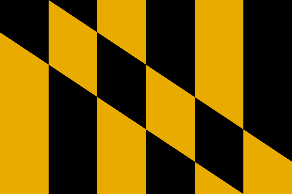 At the point I realized that, my job became simple: revert to just the yellow and black portion of the design. This was originally taken from the banner of the Calvert family, founders of the colony. Should’ve stuck with it. It’s distinctive without being harmful to the eyes or the soul. This is the one I’d go with.
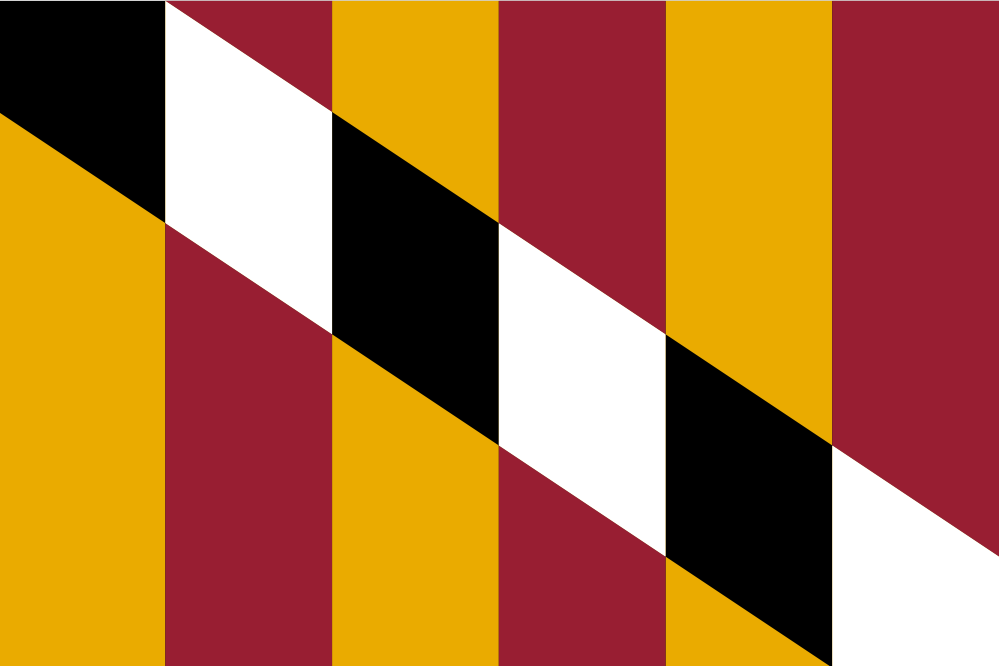
Alternatively, if you really have a perverse attachment to that clashing set of four colors, you could at least rearrange them into the Calvert pattern instead, and this is my Plan B.
 Let’s get this piece of crap taken care of right away.