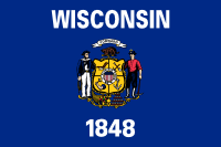
 Why do they even bother? It’s a shield on a field. And an especially bad coat of arms at that, with obscure heraldry and symbolism shoved into every nook and cranny. There’s even a US shield shoved into the middle. Both the US motto, and a fucking state motto: “Forward”. Because “Reverse” hadn’t been invented yet. Who are those two men? No one cares.
Then in the 1980s, because their crappy flag looked like every other crappy shield-on-a-field flag, instead of fixing it, they added the name of the state spelled out in big letters at the top, and presumably the year it joined the union at the bottom. No one cares. At least they didn’t litter it with (guessing) 30 stars to show what order it joined in. Which no one cares about, I might add.
This flag is a reason for people who live in Wisconsin to regret that fact. I was tempted to chuck the whole fucking thing out and start from scratch, but then I noticed something. A germ of an idea that I could salvage.
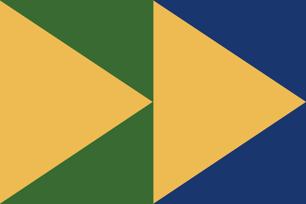
Down in the lower-right of the state seal is a stacked array of little triangles, representing mineral mining (like little ingots). A couple of those can be rearranged into the icon for fast-forward. So I salvaged the fucking motto: Forward!
Why are the triangles yellow? It’s what Wisconsin is actually known for: cheese wedges.
The background colors were my own idea. I’ve been to Wisconsin a number of times, and I remember that it includes some beautiful woodlands, and it has more Great Lakes shoreline than any state except Michigan. So I symbolized those with green and blue.
 Sometimes there’s a good design hidden in a bad one.
 Simplify.
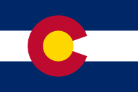 Colorado’s flag is pretty good: a fairly classical stripes-of-color design with a central thingy to give it some individual character… and that thingy isn’t their damn state seal.
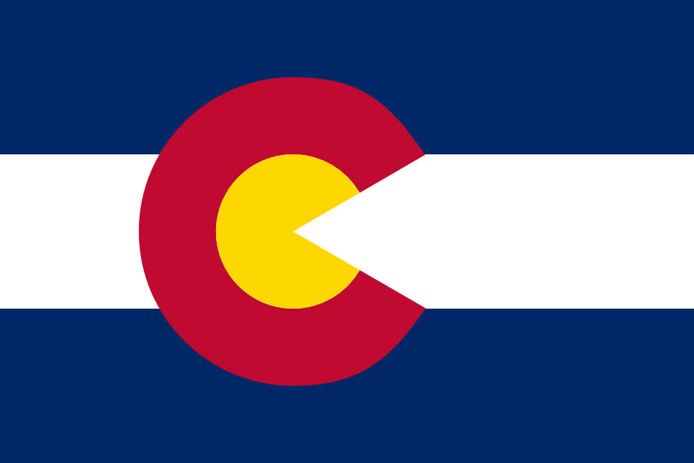
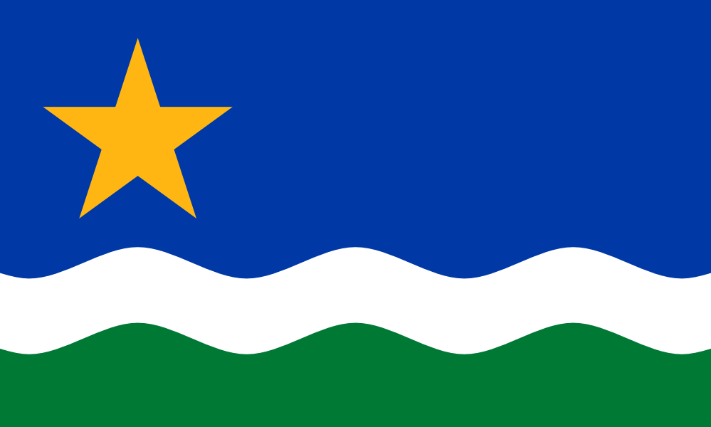
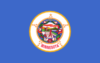 Blech. Minnesota’s flag is yet another “shield on a field”, and the fact that the blue field is a little lighter than most of the other crappy flags of this kind doesn’t save it. Especially because the seal in the middle is an incredibly bad design, too.