
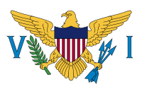
 You can just tell that this flag came from the military. After the U.S. took control of the “Danish West Indies” in 1917, the new territorial governor installed in 1921 – a Navy real admiral – asked one of his officers to provide a flag. The captain picked a guy who drew a simplified version of the U.S. coat of arms, and in a flash of inspiration, added the letters V and I. To this day, no one knows what the letters stand for… the Roman number 6, maybe? It’s a total mystery.
And it’s on a plain white field, so you can’t even read it as a flag if it’s on a white background.
There is literally nothing good to work with here.
 Thank God for the Danes, then. They had a flag of sorts for the colony. It consisted of their own flag in the canton, which we obviously can’t keep, and… a field of light blue. Not much, but it’s something.

Instead of stuffing a red flag with a white cross in the canton, how about putting a diagonal field of red with a white border in the same corner? Tweak the blue a little bit to better represent the Caribbean Sea, and we’re done.
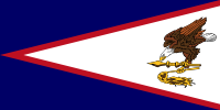 Not all bad flags need a major overhaul. Sometimes you have a cromulent flag design that’s spoiled by just one thing. That’s American Samoa’s.
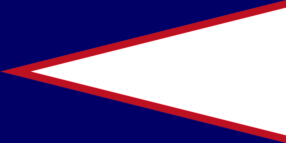 To be honest, I just don’t like the eagle on the flag. It’s an attempt to incorporate the U.S. Seal into the design, which is generally a bad idea: seals don’t belong on flags (unless maybe it’s an actual seal). Also, there are no eagles in the Samoan islands, so it doesn’t represent the territory in any way. With its attacking profile, it seems overly militaristic, which is just a bad thing to enshrine in a banner. (I wasn’t surprised to find that the design was chosen by the Army after World War 2.) And ultimately, the flag looks fine without it.