 Simplify.
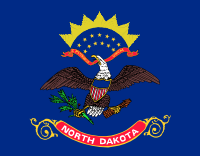
North Dakota’s flag is yet another crappy flag, created by just slapping emblems on a blue background and calling it a flag. In this case, they spelled out the name of the state (sigh), added a direct copy of the eagle from the U.S. seal, even down to the “E Pluribus Unum” motto (SIGH), and threw in thirteen stars, because… Betsy Ross (SIGH)! There almost nothing remotely original or distinctive about it.
Almost.

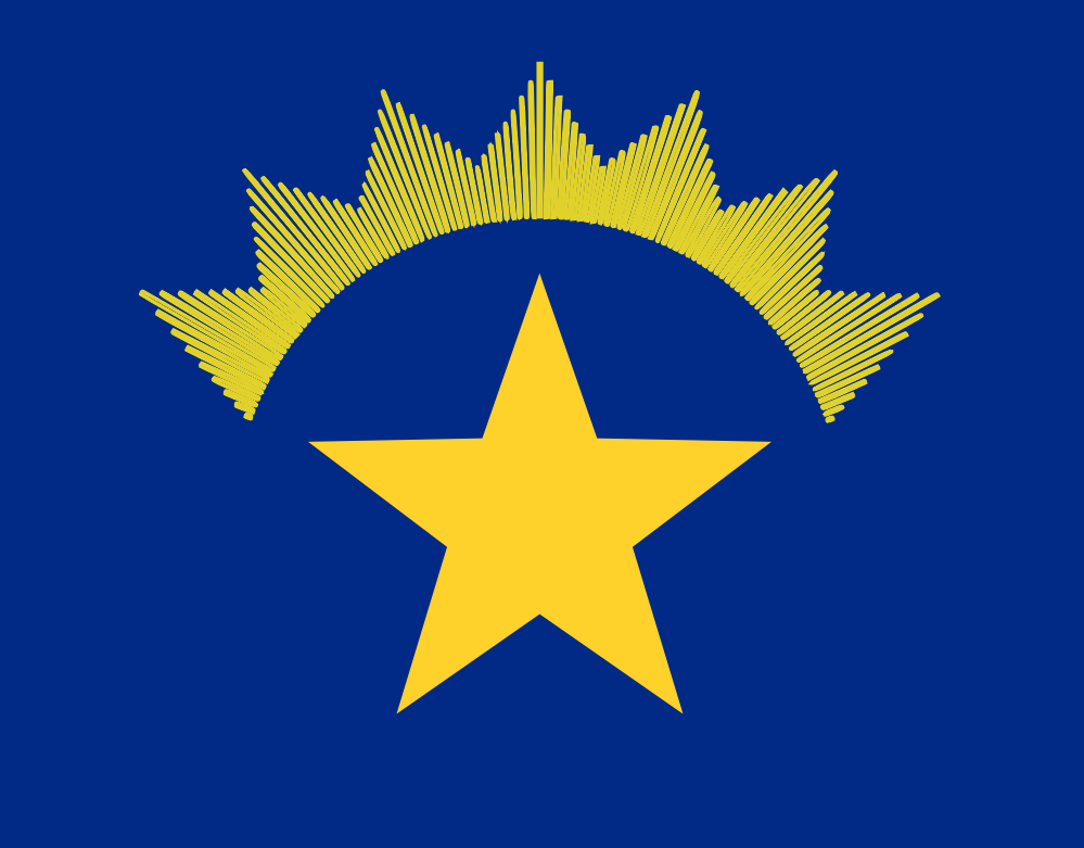
The solution was… simple. Remove the name. Remove the U.S. Seal and Motto. Remove all but one of the stars, and enlarge it. And enlarge the halo/crown to match. There ya go!
