 Not all bad flags need a major overhaul. Sometimes you have a cromulent flag design that’s spoiled by just one thing. That’s American Samoa’s.
American Samoa is a territory of several islands that you probably know nothing about, except maybe that Mike Bloomberg and Tulsi Gabbard won the delegates in its Democratic presidential caucus. It’s an odd place. It’s in the south Pacific Ocean, kinda sorta near New Zealand, but just east of the International Date Line. About 55,000 U.S. citizens – most of Samoan ancestry – live there.
We have to call it American Samoa because there’s also Just Plain Samoa, the part of the archipelago which was ruled by New Zealand until it gained independence in the 1960s. American Samoa does most of its trade with the rest of the U.S., and gets financial support from the federal government, so it seems destined to remain an imperial territory indefinitely. After tuna fishing, joining the U.S. military then collecting veterans’ benefits seems to be part of their economic model.
 To be honest, I just don’t like the eagle on the flag. It’s an attempt to incorporate the U.S. Seal into the design, which is generally a bad idea: seals don’t belong on flags (unless maybe it’s an actual seal). Also, there are no eagles in the Samoan islands, so it doesn’t represent the territory in any way. With its attacking profile, it seems overly militaristic, which is just a bad thing to enshrine in a banner. (I wasn’t surprised to find that the design was chosen by the Army after World War 2.) And ultimately, the flag looks fine without it.

 Simplify.
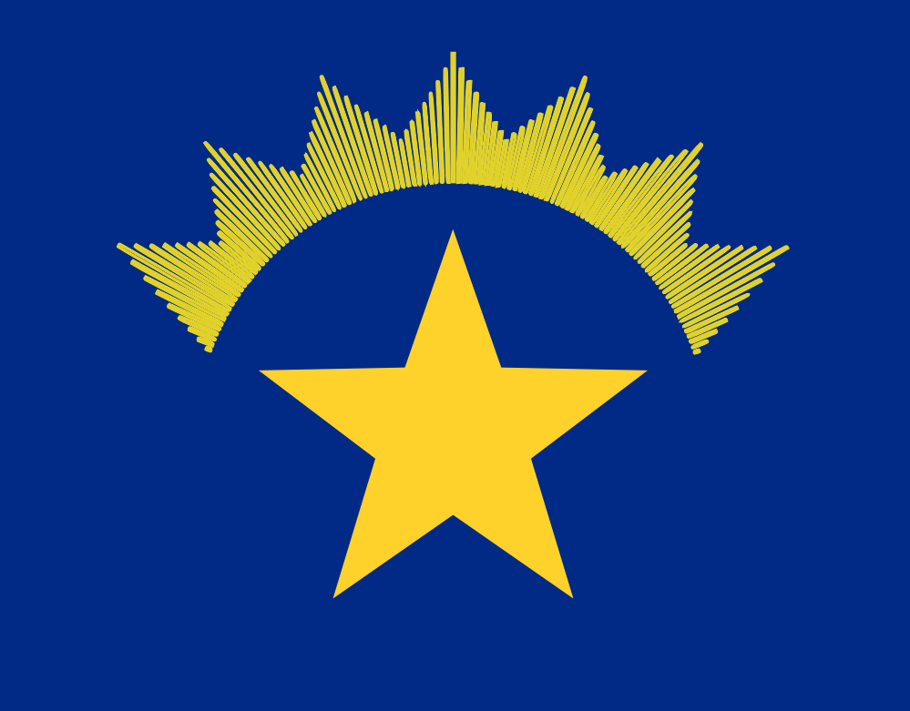
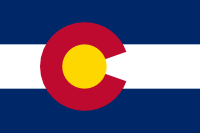 Colorado’s flag is pretty good: a fairly classical stripes-of-color design with a central thingy to give it some individual character… and that thingy isn’t their damn state seal.
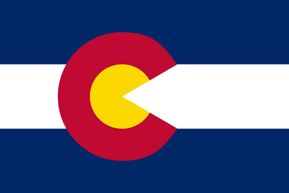
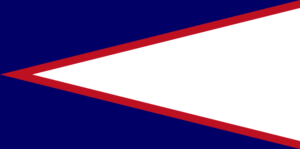
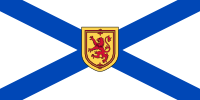 This post is at half-mast out of respect for those killed in the recent mass shooting in Nova Scotia. 🙁
 Second: the background is a reversal of the national flag of Scotland. Instead of a white saltire on a blue field, it’s a blue saltire on a white field. (It isn’t an exact copy: for some reason, Canadian flags are all wider than your typical flags.)
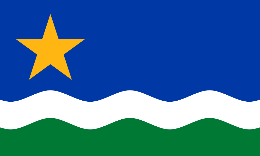
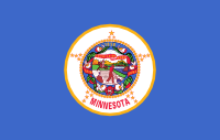 Blech. Minnesota’s flag is yet another “shield on a field”, and the fact that the blue field is a little lighter than most of the other crappy flags of this kind doesn’t save it. Especially because the seal in the middle is an incredibly bad design, too.