
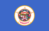
 Blech. Minnesota’s flag is yet another “shield on a field”, and the fact that the blue field is a little lighter than most of the other crappy flags of this kind doesn’t save it. Especially because the seal in the middle is an incredibly bad design, too.
Let’s name the problems: The name of the state is spelled out. It does some inscrutable stuff with the number of stars, themselves in a star pattern. The seal includes three different years… I have no idea what they all represent, and no one else knows or cares either. There’s a motto in there too. And the scene in the middle has so many symbolic bits in it that you can’t read it, even if at full size. (Trust me.) Blech.
Fortunately I don’t have to fix this, because someone else has already done it.

Rev. William Becker and Lee Herold designed and proposed a replacement, which has received some popular support in the state. Wikipedia explains: The star represents “L’etoile du Nord” and Minnesota’s natural wealth, the blue background represents Minnesota’s lakes and rivers, the white represents winter, and the green represents farmland and forests. The waves represent the name Minnesota, a Dakota word which means “sky-tinted waters”. There’s more behind it. This is a good flag, Minnesota: stop spinning your wheels and go for it.
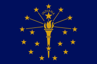 The flag of Indiana isn’t bad… it just needs a little work to overcome two of my least-favorite flag design failures: words and too many stars.
 And for the love of God, what is it with states making a big deal out of how many states joined the Union before them, by littering their flags with stars to show how many? Indiana even goes to the trouble of having 13 in the outer ring (stolen from Betsy Ross), then 5 more in the inner semi-circle, plus one slightly bigger star for itself. Too much arcane symbolism is getting wrapped up here. Delete the stars… except the one for Indiana, at the top.