 I’m gonna catch holy hell for doing this one, so I might as well get it over with.
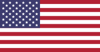
The U.S. flag is a mess. It really is. It follows a few of the principles of good flag design, such as using just a few colors, and being distinctive (before others started copying it). But it drops the ball in a big way with simplicity.
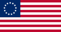 Betsy Ross was pushing it by including a stripe for each and every one of the 13 colonies that were joining to form the union. Also including 13 stars was redundantly gilding the lily, though at least she found a nice pattern for them, so it’s identifiable as a thing in itself – a circle – not just a bunch of stars.
Then they started adding states. At first they not only added a new star for each one, but also a new stripe. They realized pretty quickly that they were making an already bad design worse, and reverted to the bad design, with 13 stripes. But they Kept! Adding! Stars! 13 was already too many, and now we’re stuck with 50 of the damn things. (And more, once we finally do the right thing and give statehood to D.C. and Puerto Rico.) Do you have any idea how many schoolkids have been reduced to tears, trying to figure out how to draw 50 fucking stars on their U.S. flag? It’s shameful.
 The flag of Texas takes the U.S. flag and minimalizes the hell out of it: one star, one red stripe, one white stripe. I like that, but it goes farther than necessary. A “United States” flag needs to have stripes: plural. It just doesn’t need thirt-fucking-teen of them.
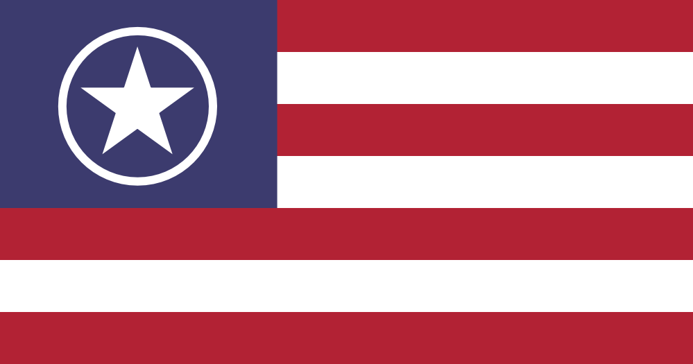
Instead of unlucky 13 stripes, lucky 7 stripes is enough. It doesn’t symbolize anything in particular, but that’s OK because it doesn’t have to. An odd number is good for vertical symmetry, which is nice to have in a design. Having an area of white on the edge of a flag is a bit of a problem if you don’t have a gray background on your web site, after all. (Which is where Texas screwed up. Russia too.)
Ross’ arrangement of the original 13 stars was a nice touch… there’s a reason that flag gets hauled out from time to time. So I’ve revived the circle, now as… a circle. With a big star in the middle, and that does symbolize something: it’s 1 country now, not 50-something states.
There are already 51-star and 52-star designs that have been figured out, for when/if we make states out of our two largest territories. But rather than adopting those, it would make more sense to take advantage of the opportunity to adopt a new flag that will never be obsolete.

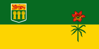 Canada’s provincial flags include some real trainwrecks, but Saskatchewan’s isn’t one of them.
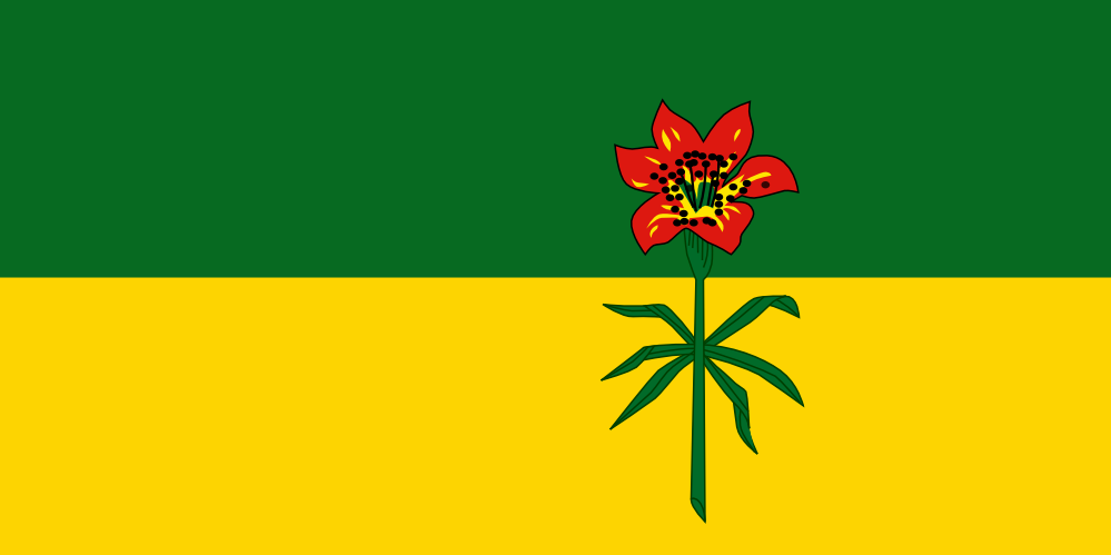
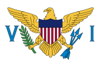 You can just tell that this flag came from the military. After the U.S. took control of the “Danish West Indies” in 1917, the new territorial governor installed in 1921 – a Navy real admiral – asked one of his officers to provide a flag. The captain picked a guy who drew a simplified version of the U.S. coat of arms, and in a flash of inspiration, added the letters V and I. To this day, no one knows what the letters stand for… the Roman number 6, maybe? It’s a total mystery.
 Thank God for the Danes, then. They had a flag of sorts for the colony. It consisted of their own flag in the canton, which we obviously can’t keep, and… a field of light blue. Not much, but it’s something.
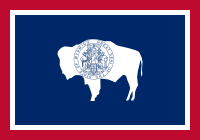 If you’ve been following this blog for a while, you can probably figure this one out for yourself. Wyoming has a fairly straightforward red, white, and blue graphic design with a simple white silhouette of a bison in the middle.
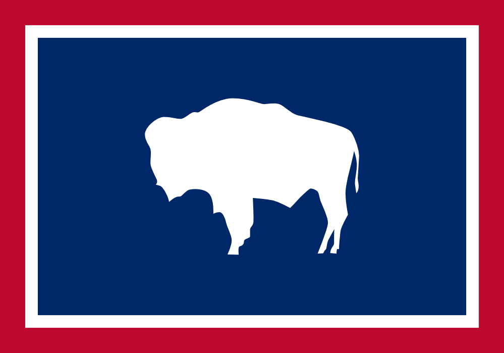
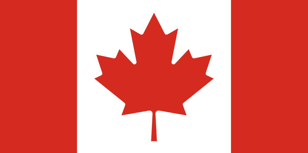
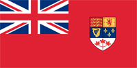 It replaces a god-awful 19th-century design that breaks the rules of good flag design into tiny pieces, by combining the tiny pieces of other flags. The “Canadian Red Ensign” committed the popular imperial sin of shoving the Union Jack – itself already a messy, compound flag – into the canton. It supplemented this fuck-up with a shield that combines symbols of… deep breath… England, Scotland, Ireland, France, and… a red three-maple-leaf thing that was used sometimes to identify Canada. Someone had the good sense to pick that out and focus on it it (a strategy I’ve taken with some of my flags here), and promote it into a national flag.