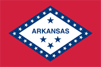
 Arkansas’ flag is another combo platter of problems and problematic.
Let’s start with the problematic: the racist legacy. Designer Willie Hocker was kinda clever. She turned the Confederate battle flag into a flag that wasn’t the Confederate battle flag, but still looked like the Confederate battle flag, by morphing the starry X inside-out, into a diamond shape. Clever. Racist, but still clever.
There’s also the set of four stars, which refer to the national empires that the territory has been part of: France, Spain, the U.S., and… the Confederacy. Hocker’s original design was only three stars… the last one was added in 1923, as a rather obvious hand-job to white supremacists who still had a hard-on for their grandfathers’ treason.
There are also simple design issues with the flag. The word Arkansas in the middle of it (added by a committee) is the most obvious no-no. There’s also all those stars (yet again indicating what order the state was added to the union), and combined with the stars in the middle you have way-the-fuck-too many stars. But these problems are easily solved.
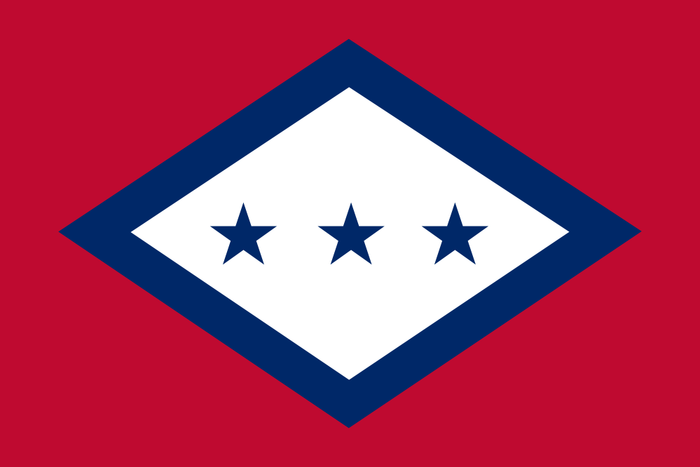
This simpler design actually harkens back to Hocker’s original design, by arranging the three stars back into a row, without the name of the state. The diamond shape was supposed to represent Arkansas’ status as the only diamond-producing state, and that’s fine. Removing the stars from the blue lines fixes both the Confederacy nostalgia and the busy-ness. So we’re left with a flag that leaves much of the old design intact, but strips out the cruft and the racist dog-whistling. And it’s almost elegant.
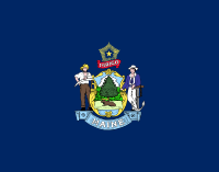 It was crappy state flags like this that inspired me to start this project. Like several other states, the legislature of Maine wasted valuable paper and a very little bit of their time, by writing a law that declared that their state flag would be their state seal on a field of dark blue.
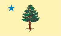 What makes their choice unforgivable is the fact that they were replacing something better, a flag that almost meets my standards. This was the Maine flag from 1901 to 1909. The blue star represents the North Star. Maine’s official knickname is “The Pine Tree State”, and pines were also used in a various other flags of the New England region. The only thing really wrong with this flag is the tree illustration, which is too fussy and detailed for a flag, and no two people are going to render it the same.
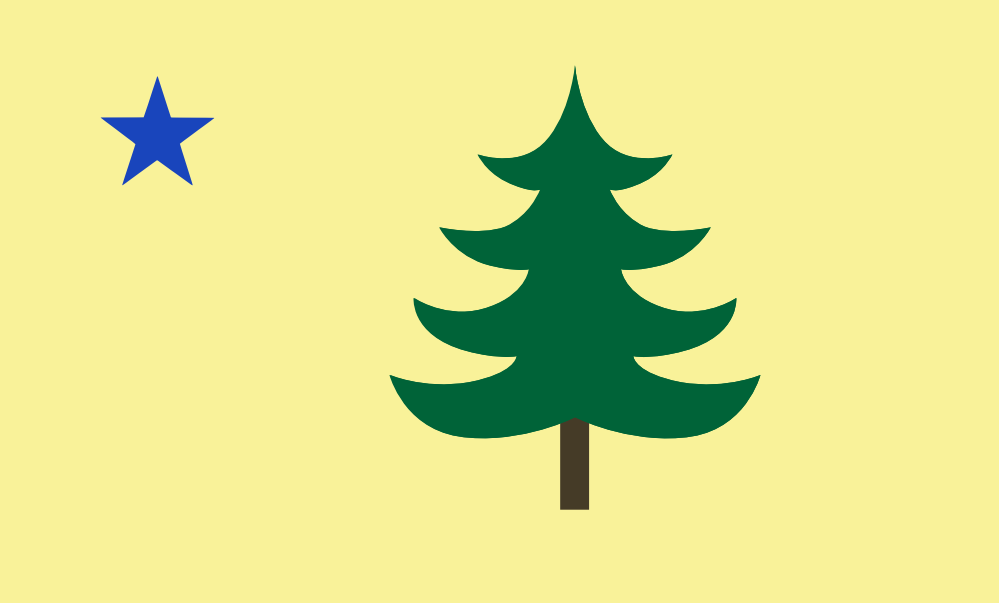
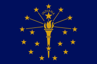 The flag of Indiana isn’t bad… it just needs a little work to overcome two of my least-favorite flag design failures: words and too many stars.
 And for the love of God, what is it with states making a big deal out of how many states joined the Union before them, by littering their flags with stars to show how many? Indiana even goes to the trouble of having 13 in the outer ring (stolen from Betsy Ross), then 5 more in the inner semi-circle, plus one slightly bigger star for itself. Too much arcane symbolism is getting wrapped up here. Delete the stars… except the one for Indiana, at the top.
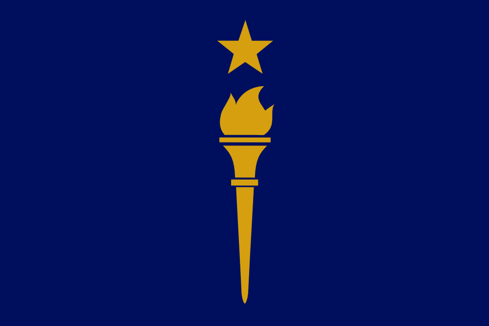
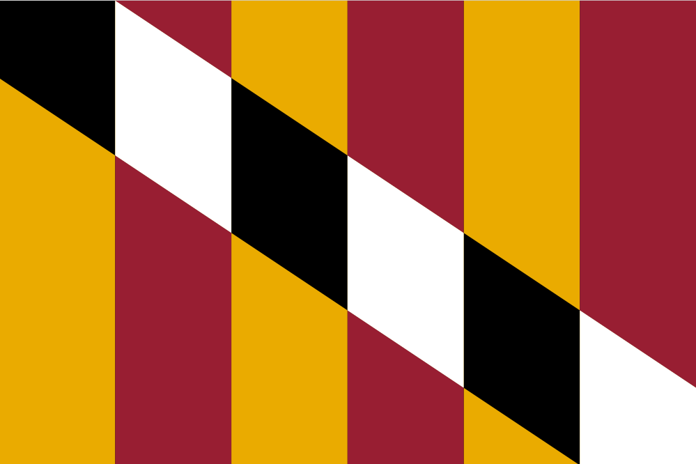
 Maryland’s old flag is painful to look at. Somehow, it ranked fourth (meaning “good”) in the North American Vexillological Association’s survey of state flags! Those people have got to be out of their minds. I assume they gave it credit for daring to be ugly, or for engaging in some kind of perverse vexillo-illogical juxtaposition.
 My first attempt to fix this mess got rid of the repetition, and overlapped the patterns and colors in a way that… sort of works, in a post-modern kind of way. Still a bit anxiety-inducing, but better. An artistic schoolkid could remember this, maybe.
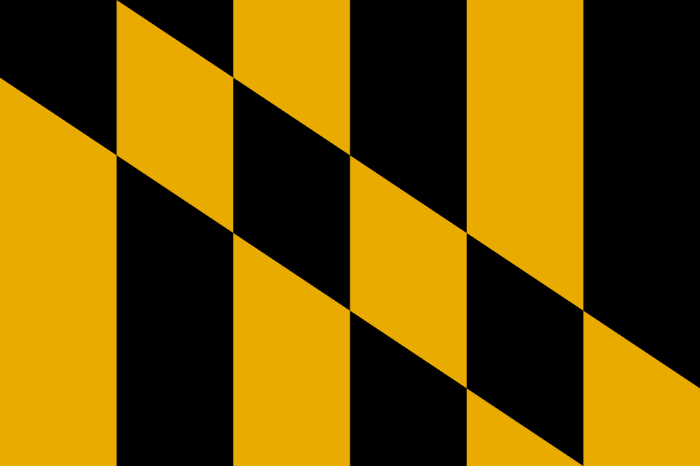 At the point I realized that, my job became simple: revert to just the yellow and black portion of the design. This was originally taken from the banner of the Calvert family, founders of the colony. Should’ve stuck with it. It’s distinctive without being harmful to the eyes or the soul. This is the one I’d go with.